


The table of content
Introduction
From line view to deep analytics
In many manufacturing plants, short interruptions of a few seconds or minutes occur far more often than major breakdowns, yet their impact is poorly understood. These micro-stops are resolved quickly, rarely documented in detail, and, even when automatically detected, accumulate into large event logs that are difficult to interpret using basic reports or spreadsheets. As a result, it is challenging to quantify how much capacity they consume, to identify systematic patterns, or to justify targeted improvement projects.
Infinity Technologies developed Micro-stop Monitor to address this gap by transforming raw micro-stop event data into structured, interpretable insight. The solution consolidates stops over days, weeks, or months, highlights how many events occurred, how much downtime they generated, which standardized reasons dominate, and on which stations and shifts they appear most frequently. This provides engineers, continuous improvement teams, and management with a clear, data-backed basis for prioritising actions, monitoring the effect of interventions, and supporting investment decisions.
Micro-stop Analytics: purpose and role
Micro-stop Analytics is designed to turn a large history of micro-stop events into deeper insights that support structured improvement work and portfolio decisions. Where Micro-stop Monitor answers “what is happening on this line right now?”, Micro-stop Analytics focuses on “what patterns do we see over time and across stations, and what should we do about them?”. It provides tools to aggregate, slice, and explain micro-stop data over weeks and months, helping teams move from monitoring to analysis and prioritisation.
How it extends Micro-stop Monitor
Micro-stop Monitor already detects and classifies micro-stops in real time, storing each event with timestamps, station, reason, and confidence. Micro-stop Analytics builds directly on this event history. It introduces:
- long-range KPIs and trend views (days, weeks, months);
- deeper Pareto and station-by-reason breakdowns;
- shift timelines that show when micro-stops occur within a day;
- event exploration and filtering across large datasets;
- ML-assisted suggestions and a labeling queue for UNKNOWN or low-confidence stops.
In essence, Monitor is the “line-level front end” for operators and supervisors, while Analytics is the “analysis workbench” for engineers and decision-makers who need to understand structural patterns, not just current status.
Typical users and use cases
Process engineers use Micro-stop Analytics to:
- identify dominant loss mechanisms by reason and station;
- study time-of-day and shift patterns;
- drill down from Pareto charts to specific micro-stops when preparing root-cause analyses or improvement charters.
Continuous improvement (CI) specialists use it to:
- prioritise which lines, stations, or reasons deserve projects;
- quantify the baseline and track impact of implemented actions over longer periods;
- compare behaviour across lines or plants that run similar products.
Production and plant management rely on Analytics for:
- a concise view of micro-stop-related performance at weekly or monthly reviews;
- objective justification of investments (for example, buffers, automation, or maintenance work) based on cumulative downtime and clear reason codes;
- monitoring how quickly UNKNOWN and low-confidence stops are being reduced as rules and models improve.
Together, these roles make Micro-stop Analytics the main environment where micro-stop data is converted from raw events into decisions about where to focus time, money, and engineering attention.
Overview analytics: seeing the big picture
A core value of Micro-stop Analytics is that it aggregates thousands of individual events into a compact view of how a line behaves over longer periods. Instead of scrolling through raw tables, engineers and managers can glance at one screen and understand whether micro-stops are under control, getting worse, or shifting from one dominant cause to another. This “big picture” view is especially important when preparing weekly reviews or deciding where to focus the next improvement project.
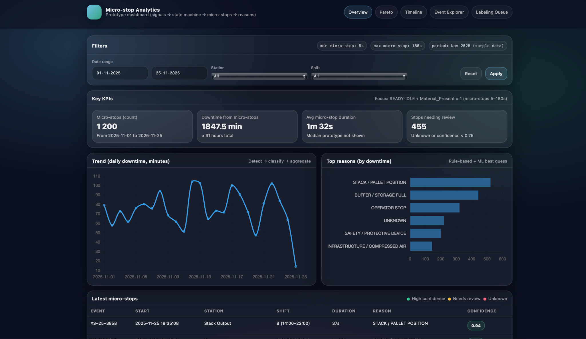
In the overview screen, key KPIs and trends summarise the entire selected period. The application shows the total number of detected micro-stops, total downtime they caused, average micro-stop duration, and how many events still require review because they are UNKNOWN or have low confidence. Alongside these point metrics, a trend chart plots daily downtime over the chosen date range, revealing patterns such as weeks with unusually high micro-stop losses, days impacted by a particular product mix, or visible effects of recently implemented improvements. Together, the KPIs and the trend make it easy to answer questions like “Is the line getting more stable?” and “Are we reducing micro-stop-related downtime over time, or just shifting it around?”.
The same overview also highlights the top reasons by downtime so that users can immediately see which causes dominate losses in the selected period. For each standardized reason, such as STACK / PALLET POSITION, BUFFER / STORAGE FULL, OPERATOR STOP, SAFETY / PROTECTIVE DEVICE, or UNKNOWN, the screen displays the total time attributed to that cause. This effectively applies the Pareto principle at the overview level: a small number of reasons typically account for most of the micro-stop time. By combining the high-level KPIs, downtime trend, and top-reasons panel, Micro-stop Analytics gives teams a concise but powerful starting point for deeper root-cause analysis in subsequent sections of the application.
Root-cause and pattern analysis
Once the big picture is clear, the next step is to understand which concrete mechanisms drive micro-stop losses and where they occur. Micro-stop Analytics supports this with views that break downtime down by reason and station, and that show how micro-stops are distributed in time within a shift. This combination helps distinguish between “what” is causing losses and “when/where” they appear, which is essential for defining focused improvement actions rather than generic “reduce downtime” goals.
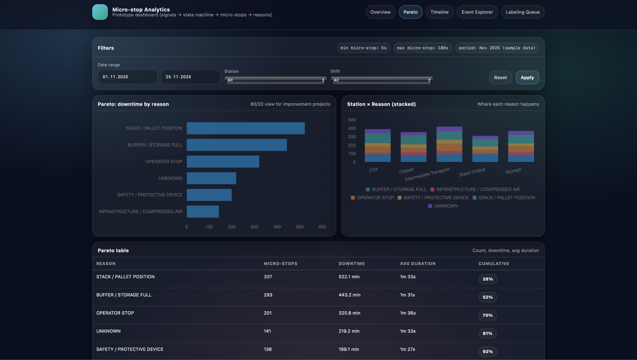
In the Pareto view, downtime is first ranked by standardized reason and then related back to specific stations. A horizontal Pareto chart shows which reasons account for most of the micro-stop time in the selected period, while a Station × Reason stacked visualisation reveals where each of these reasons actually happens along the line. Below, a Pareto table provides exact numbers for micro-stop count, total downtime, average duration, and cumulative share for each reason. Together, these elements let engineers answer questions such as which causes dominate overall losses, whether a problem is concentrated on one station or spread across several, and how much time could be recovered if a particular reason were reduced by a given percentage.
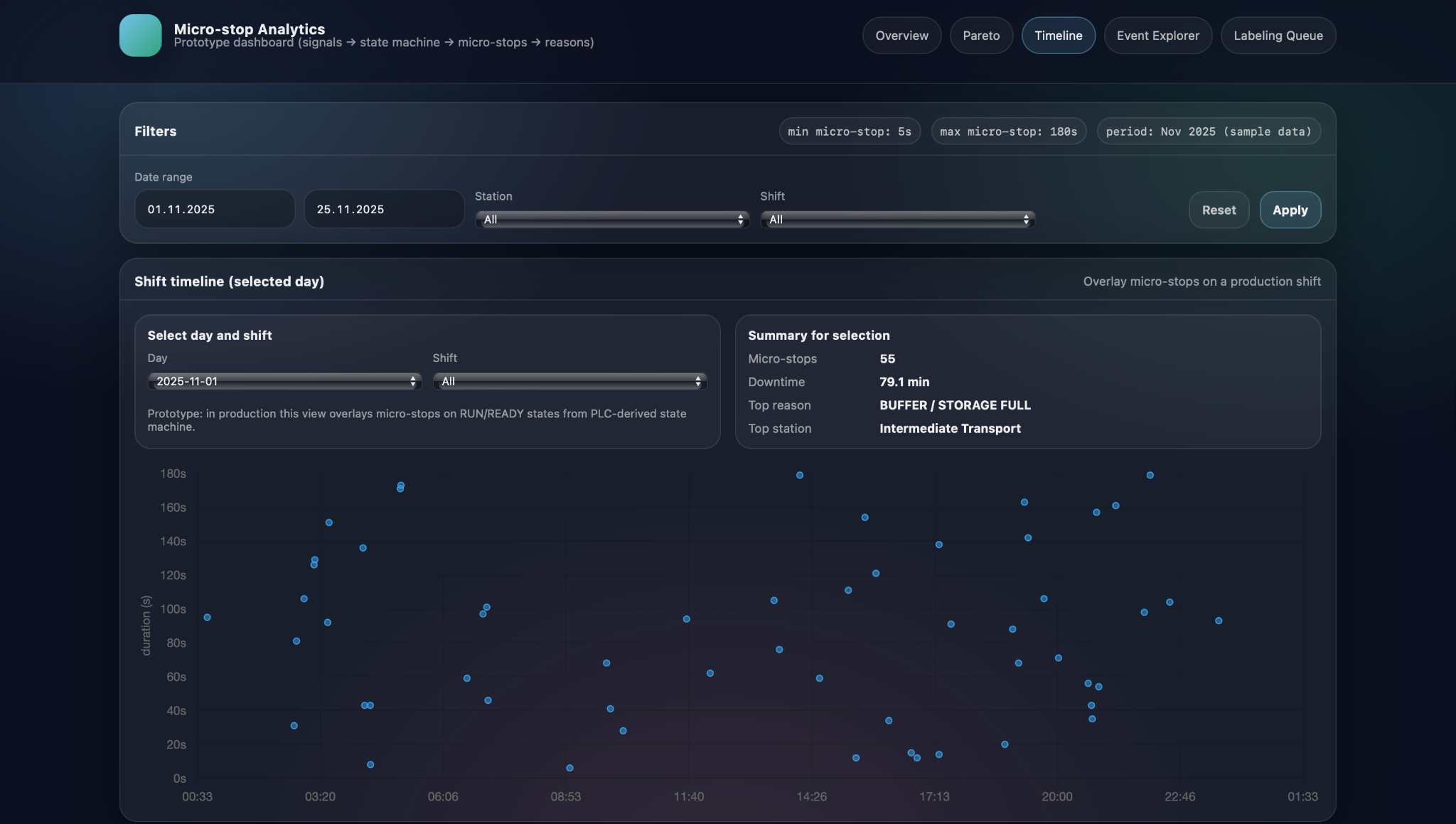
Complementing this, the shift timeline view focuses on the time structure of micro-stops within a day. Here, the user selects a day and shift, and sees individual micro-stops plotted as points with clock time on the horizontal axis and stop duration on the vertical axis. This scatter representation makes temporal patterns immediately visible: clusters of stops around shift changes or breaks, repeated long stops at the same time every night, or bursts of short interruptions during specific production runs. By combining the Pareto-by-reason-and-station view with the time-structured shift timeline, Micro-stop Analytics helps teams move from static counts to dynamic patterns, which often reveals root causes that would be invisible in aggregated numbers alone.
Event-level investigation
Micro-stop Analytics does not stop at charts and KPIs; it also provides tools to investigate individual micro-stops when deeper analysis is required. After identifying a suspicious pattern in the overview, Pareto, or shift timeline, engineers can switch to event-level views to see the exact stops that make up that pattern and examine their details one by one. This keeps the workflow consistent: start broad, then progressively narrow down to the specific incidents that need attention.
Event Explorer and filters
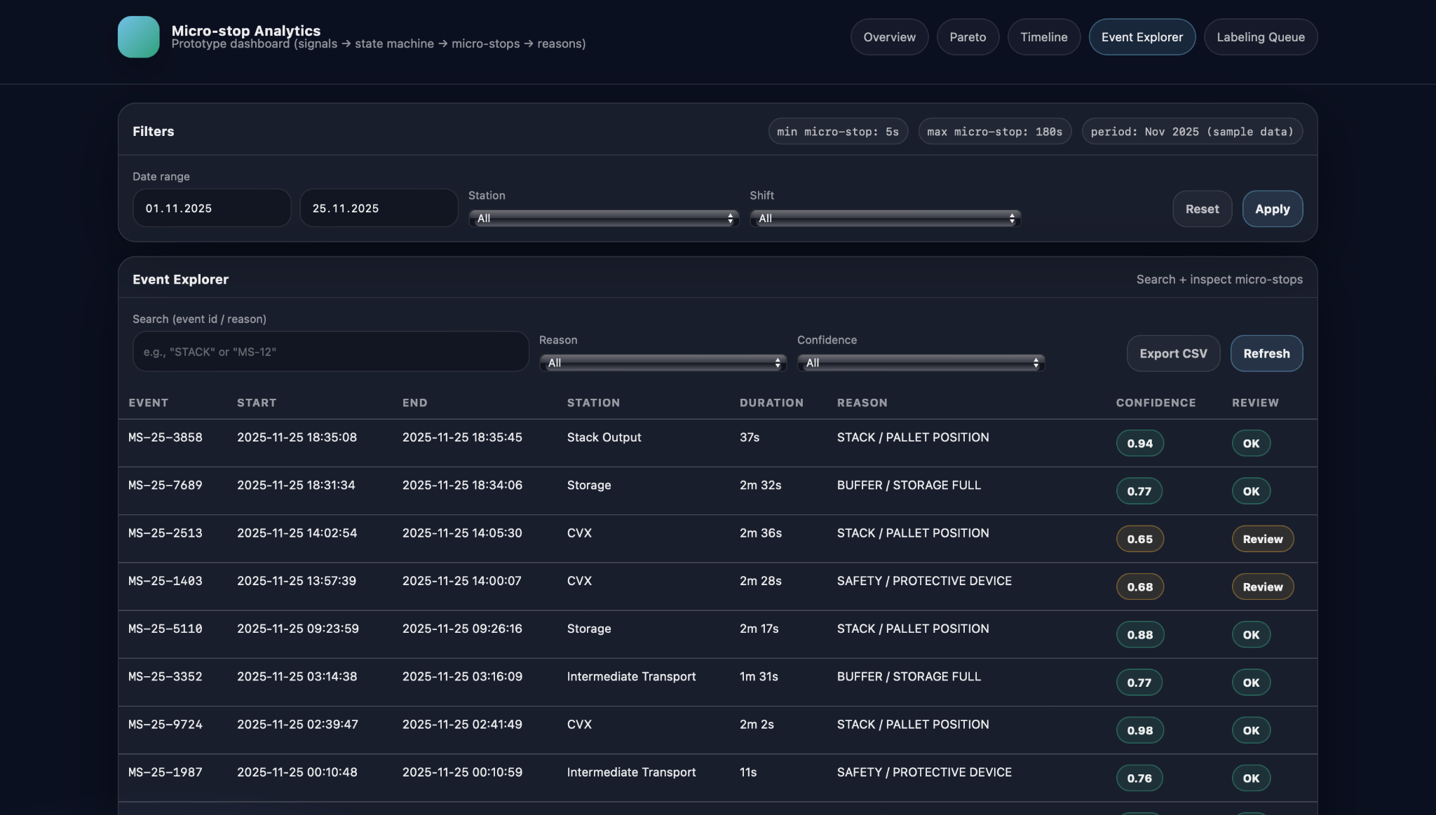
The Event Explorer offers a searchable, filterable table of micro-stop events for the selected period. Users can filter by date range, station, reason, and confidence level, focusing for example on buffer-related stops on a particular station, or on all events that still need review because their classification confidence is below a threshold. The table itself typically shows the event ID, start and end timestamps, station, duration, assigned reason, and classification confidence, plus a simple status indicator such as “OK” or “Review”. This makes it practical to scan through dozens of events that share a pattern, compare them, and select specific ones for further inspection or manual relabeling.
From aggregated views to individual micro-stops
A key design principle of Micro-stop Analytics is smooth navigation from aggregated views down to individual events. From the overview’s top-reasons panel or the Pareto-by-reason chart, users can jump directly to a filtered Event Explorer view that shows only the micro-stops contributing to a particular reason or station. Similarly, from the shift timeline, clicking near a cluster of points opens the corresponding subset of events, allowing engineers to see exactly which micro-stops formed that pattern. From there, a single event can be opened in more detail or sent to the labeling queue if its classification looks questionable. This drill-down path—from high-level trends, through focused subsets, to specific micro-stops—ensures that insights discovered in charts can always be grounded in concrete, inspectable data.
ML and human-in-the-loop
Micro-stop Analytics adds a machine-learning layer on top of the deterministic rules to handle stops that are too complex or subtle for simple if–then logic. The goal is not to replace rules, but to complement them: rules cover clear-cut cases with high confidence, while the model provides data-driven suggestions for events where no rule matches or multiple rules could apply.
Feature-based suggestions on top of rules
For each micro-stop, the system constructs a compact feature vector that describes what happened around the stop moment. These features can include which PLC signals changed state in a short window around the start time, aggregates per station or module, stop duration, and simple context such as shift or product type. A supervised model trained on historically labeled events uses these features to predict the most likely reason code when the rule layer cannot assign one confidently. Its output appears alongside the rule-based result as a suggested reason with an associated confidence score, giving engineers an additional perspective while keeping the underlying logic explainable.
Labeling queue to reduce UNKNOWN
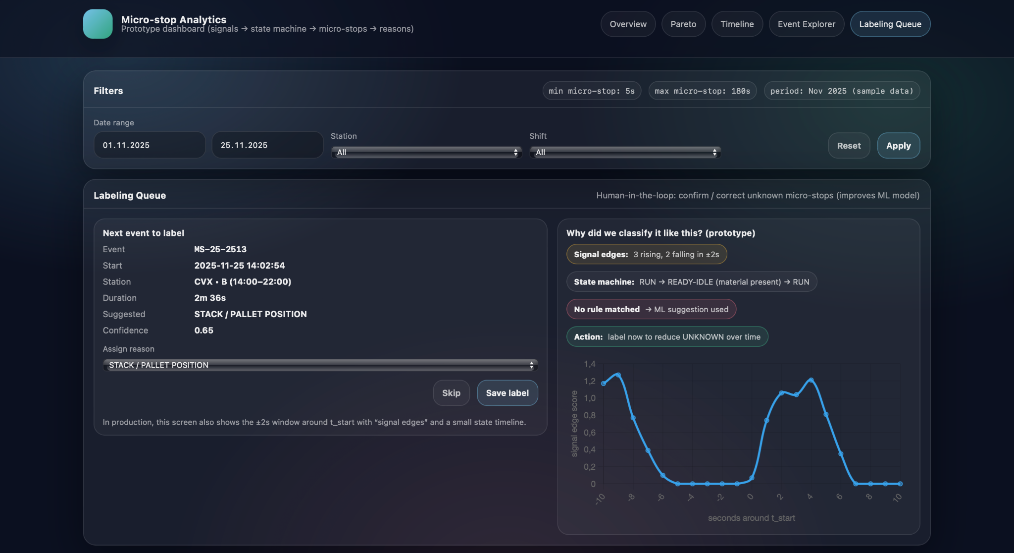
Because the model needs reliable training data, Micro-stop Analytics introduces a labeling queue for micro-stops that are UNKNOWN or have low-confidence classifications. For each event in this queue, the screen shows key details such as station, timestamps, duration, suggested reason, and confidence, as well as a short explanation of why the model proposed that label—for example, which signal edges were detected or which state-machine pattern was present. An engineer or experienced operator can then either confirm the suggestion or override it by selecting a different reason from the catalog, after which the event leaves the queue with a confirmed label.
Continuous learning loop
The confirmed labels gathered through the queue feed directly back into the model’s training dataset, creating a continuous learning loop. UNKNOWN or low-confidence events are reviewed and labeled by humans, the model is periodically retrained on this richer dataset, and its suggestions become more accurate and better calibrated. As a result, the share of UNKNOWN micro-stops gradually decreases, and the labeling queue shifts from routine cases to genuinely new or unusual patterns. Over time, this cycle allows Micro-stop Analytics to keep improving its understanding of the line while ensuring that humans remain in control of how reasons are defined and applied.
Using Micro-stop Analytics to drive improvement projects
From Pareto insights to project charters
Micro-stop Analytics is most valuable when it becomes part of the way improvement projects are selected, scoped, and monitored, rather than just a reporting tool. By turning detailed micro-stop data into stable patterns and trends, it helps teams decide where limited engineering time and budget will produce the largest impact, and provides an objective baseline against which results can be measured.
The typical starting point is a Pareto view or top-reasons panel that shows which causes dominate micro-stop downtime for a given line, product mix, or period. If, for example, STACK / PALLET POSITION and BUFFER / STORAGE FULL together account for more than half of micro-stop losses on a veneer line, an improvement project can be framed very concretно: reduce stack-position-related micro-stops at the output station by a defined percentage, or cut buffer-full downtime on a specific conveyor. Micro-stop Analytics supports this by providing precise baseline figures—current downtime, number of events, and affected stations—so that project charters can include clear targets and expected financial impact rather than generic “reduce downtime” goals.
Once changes are implemented—such as adjusting pallet centering, modifying sensor logic, or updating operating procedures—Micro-stop Analytics allows teams to track their effect over subsequent weeks and months. The same KPIs, trend charts, and Pareto views used to define the baseline can be filtered to “before” and “after” periods, showing whether downtime for the targeted reasons is actually decreasing and whether any new reasons are emerging. Because the data is based on consistently detected and classified micro-stops, improvements can be quantified in terms of recovered minutes or hours per month, rather than inferred from overall OEE fluctuations, which are often influenced by many other factors.
When multiple lines or plants use the same micro-stop taxonomy, Micro-stop Analytics can also support fleet-level decisions. Lines producing similar products can be compared on metrics such as micro-stop downtime per shift, share of UNKNOWN events, or dominance of particular reasons, highlighting best performers and outliers. These comparisons help identify systemic design issues—for example, a station that is problematic everywhere it is installed—or confirm that a proposed investment on one line has already delivered measurable benefits elsewhere. For capital expenditure cases, being able to state that a specific cause, at specific stations, consumes a well-quantified number of hours per year provides a much stronger justification than subjective impressions. In this way, Micro-stop Analytics connects detailed operational data with strategic decisions about where to invest in equipment, automation, and process changes.
Conclusion
Micro-stop Analytics, developed by Infinity Technologies, demonstrates that even very short and often “invisible” stops can significantly affect the real productivity and utilization of manufacturing lines. By systematically collecting, standardizing, and visualizing micro-stop data, the solution converts scattered events into a clear picture of losses that can be shared and discussed by engineers, shift supervisors, and management using a common factual basis. This creates a transparent foundation for prioritizing improvement actions, evaluating the effectiveness of implemented changes, and justifying investments in technical or organizational upgrades. Ultimately, the use of Micro-stop Analytics enables manufacturers to progressively reduce hidden losses, increase process stability, and achieve more predictable and efficient production performance.


Our success stories


.avif)


Tell us about your project needs


.png)
.png)